Cooler theme palette

The Kraken-inspired theme was fun for a time, but the dark theme contrast was a bit hard on the eyes and the light theme contrast was a little muted. So I wanted to try something a little different.
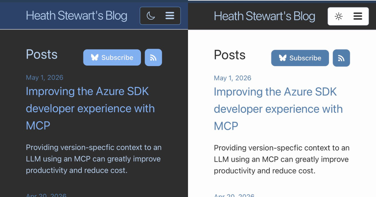
Blue Hour
I looked at a couple color palette sites for some color ideas then asked Copilot + Sonnet to work up a few color demos keeping accessibility in mind. From there I picked one I liked and had it update the necessary minima colors as well as replace the Kraken-inspired colors. It made re-theming the site pretty quick. I’m no designer, but it thought through accessibility and contrast issues I wouldn’t have considered.
I think it turned out pretty good: